
#.Overview
Mola UI is a React design system for the kind of software I like to build: admin consoles, knowledge bases, and screens where you watch AI agents work. It ships design tokens, a component library, and an AI interface layer, all documented in a public Storybook.
It’s open source under the MIT license, published on npm as @demogar/mola-ui, and the code is at github.com/demogar/molaui. At version 0.3.0 it has:
- 53 components (144 exported parts) for actions, forms, overlays, feedback, navigation, data display, and an application shell, built on Base UI for behaviour and accessibility and styled with Tailwind v4.
- An AI layer of 12 more components for streaming answers, tool calls, agent runs, citations, token usage, and confidence.
- Three patterns: whole screens composed only from the system, each with its decisions written down.
Like Beveloce and Tandemise, it’s a project I build to learn. It went public in October 2026, and I’m not claiming any users. What I can show is how it’s built, and that’s what this page is about.
#.Where It Came From
Mola didn’t start as a component library. In September 2026 I built mustdopanama.com, an editorial travel guide to Panama, and gave it its own design system. I wanted it to escape the house style that machine-generated sites tend to share (warm cream, a display serif, a copper accent, soft corners), so I looked for an identity that was distinctly Panamanian.
I found it in the mola, the hand-sewn textile of the Guna people. Layers of cotton are basted together, a design is cut through the top layers, and every edge is turned under and hemmed by hand to reveal the colour beneath. That gave the system its grammar: flat layers, hard ink keylines, a band of colour revealed under every cut edge, and no rounded corners at all.
An editorial site and an internal tool want different things, though. The guide had one call to action per screen, 17px reading copy, and no dark mode. An operator console has a primary action in every panel, tables of a hundred rows, eight-hour sessions, and states a travel guide never has: streaming, waiting for approval, failed with a retry. So in October I carried the identity into product software and re-argued the metrics, one decision at a time. Those decisions are written down as six architecture decision records in the repository.
Before this, I led the work on Atlas, ProductPlan’s design system. Mola UI is one I can show in full, down to every decision.
#.The Name, With Care
A design system named after a living craft owes it some care, so the README says plainly what Mola UI is and isn’t. It isn’t made by Guna people and doesn’t speak for them. The mola is protected under Panama’s Law 20 of 2000 as collective intellectual property of the Guna people, and the project claims no rights over it.
In practice, that comes down to a few rules:
- It borrows the method, not the motifs. Stacked layers, hard cut edges, and the revealed band, but no Guna designs, symbols, or patterns anywhere in the interface.
- It names the source wherever the name appears.
- If you want a mola, buy one from Guna artisans, so the craft supports the people who keep it alive.
As a Panamanian, I see the mola as one of the most authentic expressions of our culture. Getting this part right mattered more to me than any component.
#.What It Looks Like
All the screenshots here come from the public Storybook. The demo data belongs to a made-up platform called Cayuco, so there’s no real company or real data on screen.
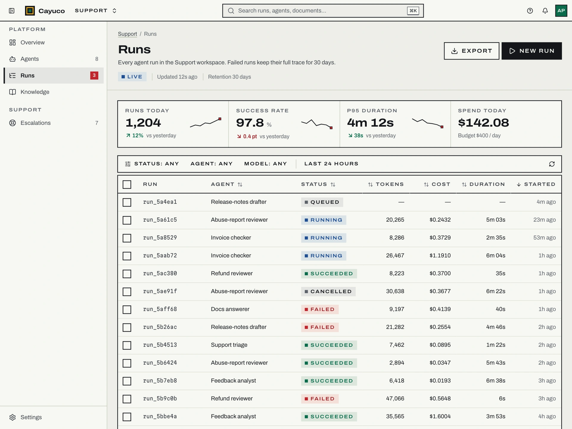
The cover above is the runs view: the application shell, four stat tiles, and a dense table of agent runs, built only from Mola UI components. Three choices shape every screen:
- Every interactive edge is an ink keyline, drawn with
box-shadowso hover can grow a revealed band outward without moving anything next to it. - Three typefaces, three speakers. Archivo for the system, Alegreya for prose a person or a model says to you, and Martian Mono for machine literals like tool arguments and run IDs. You can scan an agent transcript for what it said versus what it did from the type alone.
- State is never colour alone. Every status is a square mark, a word, and a tone, so a failed step still reads as failed in a greyscale screenshot in a bug ticket.
One rule came straight from moving to product software: the primary button is ink, and red means danger. On the travel guide, the main call to action was red, because there was one per screen. An internal tool has a primary action in nearly every panel, and forty red buttons a day teach people that red means “the usual button.” In Mola UI, red only shows up when something can be lost or has failed.
#.The AI Interface Layer
This is the part I most wanted to build. A model is a strange collaborator: it’s slow in ways nobody can predict, it answers in pieces, it acts on the world through tools, and it’s sometimes wrong while sounding certain. Each of those has to show up in the interface honestly. The AI principles page in Storybook turns that into rules the components follow.
The agent console is a working demo of most of them. You ask a question, and a simulated agent plans, calls two tools, and streams a cited answer, with the run timeline and token usage updating beside it.
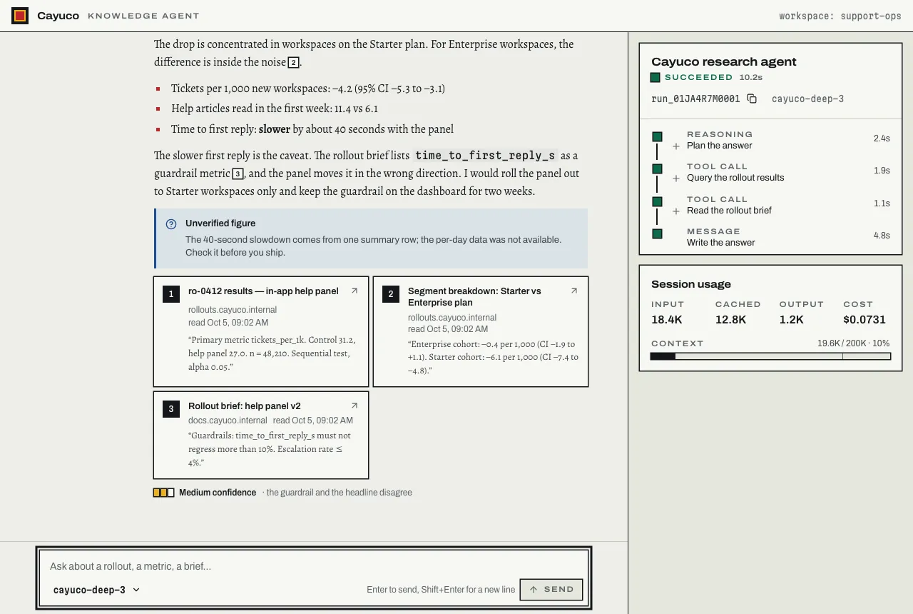
- Latency is shown as time, never as a fake percentage. An agent run has no knowable total, so a running step shows elapsed time that keeps counting.
- Streaming doesn’t steal the page. Text grows in place, the thread only follows new output if you were already at the bottom, and screen readers hear one announcement when the answer is done instead of a stream of tokens.
- Stop is always one press away. While a response is generating, the composer’s send button becomes the stop button, in the same place.
- Uncertainty is stated in words, not decimals. Models are poorly calibrated, so “87.3%” is precision the system doesn’t have. Confidence is High, Medium, or Low, and the specific thing the model is unsure about is written out as a note to verify.
- Every claim can be checked where it’s made. Each citation marker matches a numbered source, and it previews that source on hover, keyboard focus, or a first tap.
Two of these rules matter most to me, because they’re about trust.
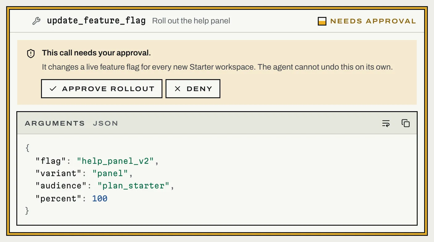
Approval comes before anything irreversible. A tool call that writes, spends, or sends waits for a person. It shows its exact arguments and says, in words, why it needs approval. Approve and Deny get the same size and weight on purpose: on an action the agent can’t undo, a screen that makes Approve the loud button has already decided for the reviewer. Bigger changes go through a change review, where saying no requires a reason, because the agent acts on that reason.
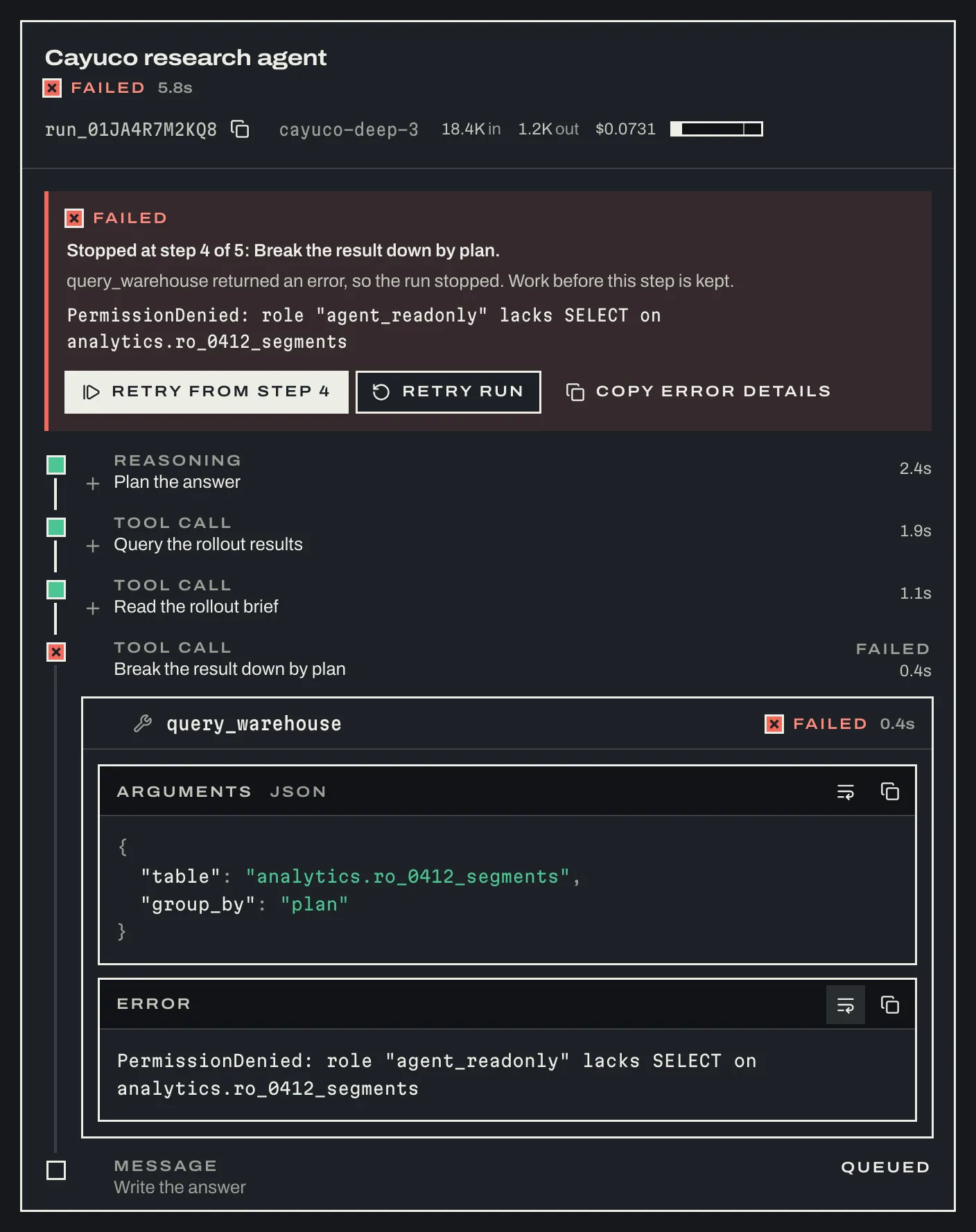
Failure is a first-class state. A failed run says which step stopped it, in a sentence and as the literal error the tool returned. It keeps the work that had already arrived, and the way back sits right next to it: retry from the failed step, retry the whole run, or copy the error details for a ticket. “Something went wrong” isn’t an acceptable message.
#.Tokens, Themes, and Density
All the design decisions live in one CSS file of tokens, and it’s the only file in the repository allowed to contain a hex colour. A test enforces that.
- Two themes, declared once. Every colour token is a
light-dark()pair, so the browser picks the theme before first paint, with no script and no flash. In the dark theme, the cloth is dyed rather than inverted. - Three densities on one attribute.
data-density="compact","comfortable", or"spacious"on any element re-scales control height, row height, spacing, and the small end of the type scale for everything inside it. No component takes a density prop, so a compact table can’t end up under a comfortable toolbar because someone forgot one.spaciousreproduces the travel guide’s original metrics. - Figma gets the same tokens. A script exports them as W3C design-token JSON that loads into Figma through Tokens Studio, and CI fails if that file is out of date.
If you’re not on React, the tokens still work: there’s a plain-CSS build with both themes and all densities.
#.How Quality Is Held
A design system is only as good as the promises it keeps when nobody’s looking, so most of the work went into gates rather than components. One command runs lint, type checks, tests, the token and manifest checks, the build, the API check, and bundle budgets. CI runs it alongside three browser jobs.
- A contrast contract. A test resolves every colour token in both themes and checks each promised text-and-background pairing against its minimum ratio. It caught a real dark-theme failure during the build (muted ink on the gold wash, at 4.00:1) before any screen did.
- Every story is a test. All 274 stories render through the real Storybook setup and must pass axe. A browser audit then re-runs axe with colour contrast in both themes, over every story and docs page, and checks every story for horizontal scrolling at 390px wide.
- Visual regression. Every story is screenshotted in both themes, and each component’s first story also in compact density, right-to-left, and forced-colours mode.
- Bundle budgets. The whole library is held to 170 kB, a tree-shaken
ButtonandFieldto 15 kB, and the stylesheet to 17.5 kB. - A reviewed public API. Every export and its type signature is written to a report, so any API change shows up in review as a diff.
- Consumers are tested, not assumed. The packed package is installed into three small apps (Vite, Vite with its own Tailwind, and a Next.js App Router app rendering from a server component), built, and checked in a browser.
- Docs can’t drift from the code. The component counts in the README are checked against the source, and a test resolves every link into Storybook, so a renamed story breaks the build instead of a reader’s link.
#.Documented for People and for Agents
Every component has a docs page that says when to use it, when not to, and what to use instead. A Choosing a component page and a versioning policy sit next to them.
Because I build most things with AI coding agents now, Mola UI documents itself for them too, from the same source: an llms.txt file, a JSON manifest of every export with its props, variants, and usage guidance, and a Claude Code skill that teaches an agent the rules and which component to reach for. They’re generated from the TypeScript source and the stories, and CI fails if they’re stale, so an agent never builds from a prop list that no longer compiles.
#.How I Built It
I designed Mola UI, made the decisions, and directed the work. Most of the code was written with Claude Code, and the repository credits it. The project’s own agent guide holds those agents to the same gates as a person: a change is ready only when every check passes, and a gate is never weakened to get to green.
The way it’s built and presented draws on Dan Mall’s Design That Scales. From the book I took a few practices: grow the system out of real product work rather than designing it in the abstract, ship it as a versioned dependency rather than code to copy, show what it builds before its parts, and admit a component only when three use cases need it. The README and the Storybook introduction open with whole screens for that reason.
Releases are automated. Pull request titles follow Conventional Commits, release-please writes the changelog and cuts the versions, and a release publishes the package to npm with provenance and to GitHub Packages. Storybook deploys to GitHub Pages on every merge.
#.Where It Is Now
Mola UI is at version 0.3.0. The Storybook is public, the package is on npm, and the code is on GitHub. It’s early: the first public release and the two after it all shipped in October 2026, and I expect the API to keep moving before 1.0.
#.Reflections
Interfaces for AI need their own states. Most component libraries stop at loading, success, and error. Agent work adds streaming, waiting for a person, partial results, retrying from a step, and being unsure. Designing those as real states, with words and not just spinners, was the most interesting part of the project.
Honesty is a design decision. No fake progress bars, no invented decimals, no nudged approvals. Each of those would make a screen feel smoother and the product less trustworthy.
Write the promise down as a test. Contrast, the no-hex rule, accessibility, bundle size, and even the counts in the README are all checked by code. A rule that only lives in a style guide slowly stops being true.
A strong identity travels if you re-argue it. Mola kept its look when it moved from a travel guide to an operator console. Almost every number underneath it changed.