

Writing reusable components is one of the many practices that help us write cleaner, more maintainable code in our projects.
It is very common that in our projects we find ourselves with the need to have a list of visual components that are going to be used in different parts of the application, for example, a button component, a label component, an input component, among others.
In many cases, we use libraries and frameworks such as React to create visual components and encapsulate this functionality so that we can reuse it in different parts of the application. This makes a lot of sense when we use React in our application as well, but many times this is not the case.
For this, there is a standard known as Web Components, which is a series of different technologies that allow us to create reusable, encapsulated and interoperable components that can be used in any web application.
##WebComponents
Web Components are blocks of code that encapsulate a core HTML structure, including its styles and JavaScript functionalities.
The use of them pursues two main objectives:
- Encapsulate functionality of visual components, as they are components completely isolated from each other. This allows us to protect them from effects that we do not want when implementing them together with other components.
- Interoperate between different components, such as sharing information or events between them.
The standard is made up of three main technologies:
- Custom Elements: It is an API that allows us to define our own custom HTML elements.
- Shadow DOM: It is an API that allows us to create a virtual DOM encapsulated within an HTML element.
- HTML Templates: It is an API that allows us to create HTML templates that we can reuse in different parts of our application.
Let’s analyze them one by one and in a little more detail.
###CustomElements
Custom Elements are a way to create custom HTML tags that allow us to encapsulate functionality of visual components, including HTML or CSS styling.
An example of a Custom Element is the following:
<my-button>Click me!</my-button>❗ One of their requirements is that they must have a hyphen in the tag name, for example, my-button, my-label, my-input, etc.
#.Shadow DOMThe Shadow DOM is an API that allows us to create a virtual DOM encapsulated within an HTML element. The goal is to create an isolated, independent and private structure within an HTML element, without affecting the rest of the document (or the DOM).
🤔 Why is this useful? Because this way we can create structures with styles and functionality that do not affect other HTML elements, since they are local to the element
#.HTMLTemplate
HTML Templates are a way to create HTML templates that we can reuse in different parts of our application. This content is inert and is not rendered until it is required to function.
#.Solving a uniformity problem
A very common use for Web Components is when we have an application that uses different frameworks or libraries to create visual interfaces. Let’s say part of our project uses React and another part uses Vue, for example.
How do we maintain uniformity between both parties? How do we encapsulate the functionality of visual components so that they are reusable in any part of the application, even if we do not use the same framework in all these parts?
Well, first this is a case where it becomes obvious that we must create a Design System for our application, the issue is how to write it so that we can support any other library where it is implemented:
- We could create flat components in HTML and CSS, like the UK Government does, where we import the CSS sheets and functionality independently (in addition to following the already defined patterns).
- Or, we could also create Web Components that allow us to encapsulate everything related to how to display those components, allowing us to encapsulate the functionality, markup and style.
We can do this in plain JavaScript/HTML/CSS or we can use a library, like Svelte, that helps us create this functionality.
#.Creating Web Components with Svelte
First, let’s create a new project. To do this, we are going to use Vite and Svelte:
npm init @vitejs/app svelte-web-components --template svelte
cd svelte-web-components
yarn
This base project has some components and scripts already created, for example we can run our base application with:
yarn devThe command we would use to compile everything would be:
yarn buildWe are going to see that this creates a file index.(...).js inside ./dist/assets/ and if we open the file we will see that it is a JavaScript file that contains all the code of our application, but packaged as a module.
We are going to alter the way our components are compiled, to do this we go to the vite configuration, in ./vite.config.js and we are going to add the following configuration:```js
export default defineConfig({
plugins: [
svelte({
compilerOptions: {
customElement: true,
},
}),
],
})
This configuration allows us to create components that can be used as Custom Elements. By default, Svelte compiles components as JavaScript modules, but with this configuration we can create components that can be used as Custom Elements. In the initial configuration, Svelte has already created a file called `Counter.svelte`, to tell it which tag we are going to use for this component, we are going to add a `tag` attribute to the component:

```html
<!-- Counter.svelte -->
<svelte:options tag="my-counter" />
And we do the same in App.svelte:
<!-- App.svelte -->
<svelte:options tag="my-app" />
Now, let’s create a new component, called Button.svelte:
<!-- Button.svelte -->
<svelte:options tag="my-button" />

<script>
  export let label = ""
</script>

<button>
  {label}
</button>
In order to use them, we must modify the main.js so that it imports the components that we are going to use:
// main.js
// ...
import Button from './lib/Button.svelte'
And within our App.svelte component we are going to use the Button component, but we are going to use it as a Custom Element:
<!-- ... -->

<my-button label="My Button" />
This will generate something like the following:
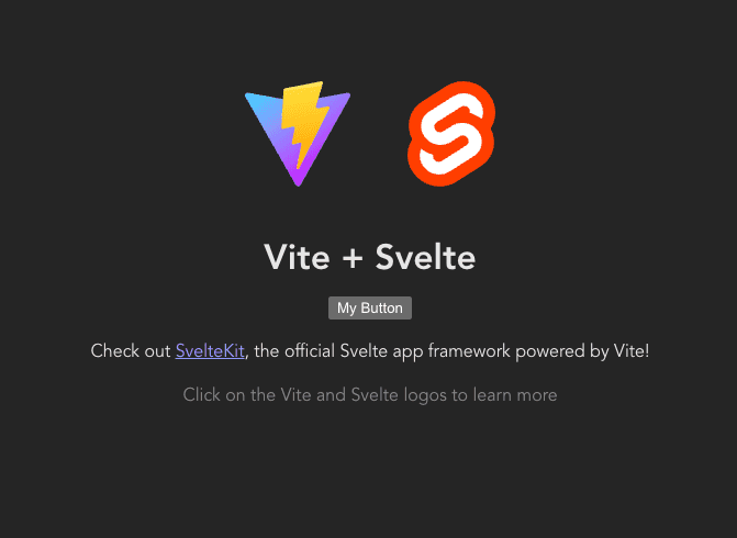
The component shown as “My Button” is in fact a Custom Element, which has been created from our Button.svelte component.
#.Styling the button
To style the button, we are going to edit the Button.svelte component and add a style sheet to it:
<svelte:options tag="my-button" />

<script>
  export let label = ""
</script>

<style>  .my-button {    background-color: rgb(249 115 22);    border: none;    border-radius: 0.25em;    color: white;    cursor: pointer;    font-size: 1.25em;    font-weight: bold;    padding: 0.5em 1em;  }  .my-button:hover {    background-color: rgb(154 52 18);  }</style>
<button class="my-button">  {label}
</button>
If we notice the changes, we can see that the <button> class is now applied to the .my-button class, to which we created a default style. The most interesting thing about this is that if we add a <button></button> in the App.svelte, it will not have the style that we have given to the Button.svelte component, since this style only applies to components that are created from Button.svelte:
<my-button label="My Button" />
<button class="my-button">Something</button>
The result would be the following:
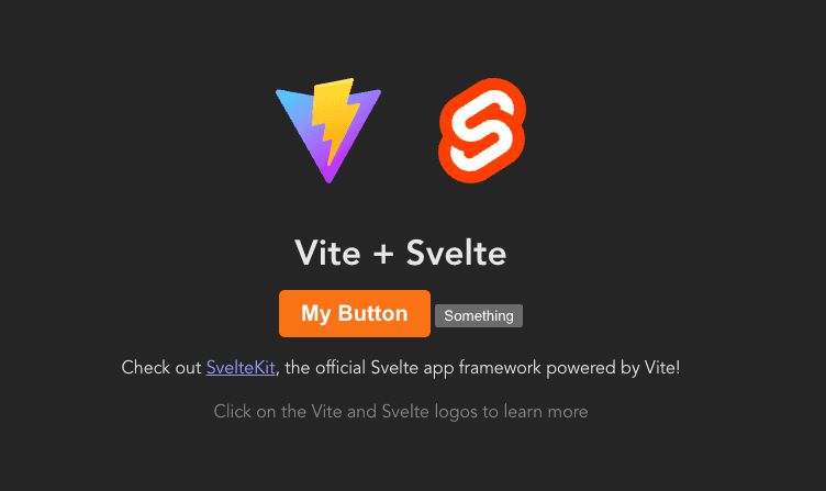
The first component is our Custom Element, styled with our own styles for that element (and does not affect other <button> elements), while the second element <button> has no styles, as it has not been created from our Button.svelte component.
#.Testing our Custom Element outside of Svelte
We are going to do an extremely simple test, but it explains the concept. To do this, let’s first compile our project:
yarn buildThis will generate a ./dist/ directory with all the necessary files to be able to use our application. Among these files we will see a JavaScript file, called index.(...).js, which contains all the code for our application, including our new button component. In a separate directory, we are going to create a file index.html and we are going to move the compiled file of our project. We are also going to copy the compiled file index.(...).js to this directory and call it index.js, so that it is easier to reference:
<!DOCTYPE html>
<html lang="en">
  <head>
    <meta charset="UTF-8" />
    <title>My Custom Element</title>
  </head>
  <body>
    <my-button label="My Button"></my-button>    <script src="./index.js"></script>  </body>
</html>
If we open this new file index.html in our explorer, we will see that the button is displayed correctly:
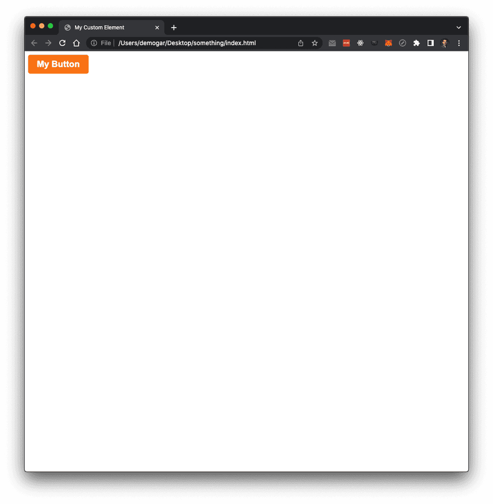
All the styles and properties of the label are already configured for us and the best thing is that they are encapsulated in the label for better control.
Let’s now imagine that, instead of index.html being a flat file, we were calling it from some other library like React or Vue. Being a Custom Element, we can use it without any problem, since it is an HTML tag that can be used anywhere. The only thing is that we would have to require or import the index.js file to be able to use it.
If we are developing a Design System Library, we could have a monorepo with different packages internally that reference each other:
@my-design-system/web: Contains the basic components of the library, such as buttons, inputs, etc., but in the form of Web Components@my-design-system/react: Contains the basic components of the library, but in the form of React Components, which internally reference and use the@my-design-system/webWeb Components.@my-design-system/vue: The same as@my-design-system/react, but for Vue.