

Engineers and developers on the one hand (especially those who develop interfaces) and designers on the other. Both trying to design and create uniform systems within the organization:
- 🎨 The designer, using Figma or Sketch (to give two examples), tries to provide as much information as possible and sees himself creating reusable components everywhere.
- 👨💻 The engineer/developer, for his part, tries to make his implementations resemble the designs as much as possible and maintains an organization of the components so that they are reusable in the same way.
- 🏦 The organization that owns these applications, for its part, already has a kind of branding as a starting point at the level of communication of the - let’s call it - “brand” that they want to reflect to their users.
This branding helps create a kind of connection between your users and your application, by providing a uniform way to communicate. This branding should also be reflected in your applications, by providing a series of uniform features in terms of how your applications look, are used, and how users interact with it.
Let’s say that your organization has already grown and has different applications:
- A website, where you sell your organization: its products and services. It is simply a marketing tool.
- Your web application, where users have a way to use the products or services you sell. This application may even have different sub-applications: an administrative part, a user application, a payment gateway, a help/support page, etc.
- A mobile application, which also works on both Android and iOS.
And here comes the question: how do you make all these applications look, feel and use the same way? How do you even ensure that designers have a single source of information, which must also be shared with their engineers?
#.An even bigger problem
Let’s say the company’s marketing team has decided to make a new face for the company. They will update all their branding, the colors and even the typography they use for all their information.
How do you make this process as easy and maintainable as possible?
The design team says: no problem, let’s do it. They make new designs and if they have everything in Figma or Sketch (well done), in a matter of a couple of hours they have already updated some of the most important designs. The engineering team says: well, look. Now we need a complete list of all the colors that have to be updated, the fonts. I also saw that the edges are now more rounded, we need to know which ones. We need that list by mail and we start working on it and we see as we go.
Oh, and by the way, that’s just for one of the apps. The process must be replicated for all.
#.Design Tokens: as an answer
Now, imagine a parallel world. Where you had a single source of information about those colors, fonts, spacing, borders, etc. and that this list was in one place and that, by updating that list, you could easily and simply update both your design and your development.
Imagine something even better: Imagine that that list, when shared between design and development, would make exactly every part of your design look absolutely the same as the implementation of that design. In the end, that listing is shared between design and development and is a shared source.
💫 Well, that parallel (and ideal) world is called: 🎨 Design Tokens.
#.What are Design Tokens?
A better explanation can be given by the people at Adobe and it says the following:
Design tokens are all the values that are needed to build and maintain a design system: spacing, color, typography, object styles, animations, etc., which are represented as data. They can represent anything defined within the layout: a color value in RGB format, an opacity as a number, an animation of type ease as Bezier coordinates. They are used instead of hard-coded values to ensure flexibility and consistency across all product experiences.
From this definition, some key words that we can use are the following:
- Data: This word is important, since each token represents a value that can be easily consumed.
- Consistency and flexibility: By being shared by all implementations and by design and development teams, tokens ensure that all applications will look the same and function the same, as long as they are shared. Likewise.
- Centralized: It is the single source of truth for design and development teams alike.
#.Ok ok. I understood, but… how do you eat this?
Let’s do a practical example. We are going to design a simple button, since in any application we will have even one button. To keep it even simpler, we’ll only focus on a web app (and ignore mobile apps).
Let’s say we design a Component in Figma that is for a button, which would look something like this:
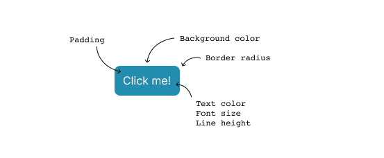
There are several values that we can abstract to keep this button consistent in its normal state:
background-colorpaddingcolor(for text color)line-heightfont-sizeborder-radius
Each of these values will be used by both the design team and the engineering team, to maintain uniformity, so we could define the following tokens, in a .json format:
{
  {
    "name": "surface-action",
    "description": "Color a utilizar en superficies que ejecutan una acción",
    "value": "#228DAE",
    "type": "color"
  },
  // ...
  {
    "name": "text-surface-action",
    "description": "Color del texto a utilizar sobre las superficies que ejecutan una acción",
    "value": "#f3f3f3",
    "type": "color"
  }
}#.At the designer level
These tokens can then be used in Figma. To do this you must use a plugin like Figma Tokens.
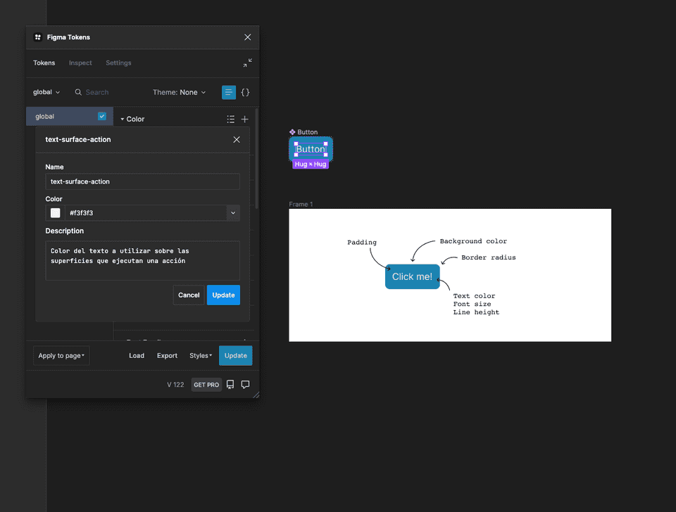
You can import the .json file you created in the previous step. This file can be in some repository where both designers and engineers have access.
⚠️ The important thing would always be to change the colors at the level of the token file and not directly in the
fillproperty from Figma since thefillproperty would always be a reference to the value oftokenin the file.
You could even create a monorepo where in one of the packages you have all the tokens saved and versioned.
#.At the implementation level
At the developmental level, life is not more difficult. As it is a .json file. There are hundreds of libraries you can find to transform design-tokens in .json format to whatever you are using: CSS variables, SASS maps, stylus, you could even use .json directly from your components.
Let’s say you decide to transform your tokens into CSS variables and they would look something like this:
:root {
  --color-surface-action: #228DAE;
  --color-text-surface-action: #f3f3f3;
}
With this, you could create your <button /> with a primary style and have the variables defined locally in your new component, which would look something like this:
button.primary {
  --button-bg-color: var(--color-surface-action);
  --button-text-color: var(--color-text-surface-action);
}

// ...

button {
  background-color: var(--button-bg-color);
  color: var(--button-text-color);
}
And when implementing it:
<button class="primary">Click me!</button>Since you would have different color options, you could end up having other colors defined such as red-100 or yellow-300 and you would play with the background colors and the text colors.
#.If the token changes…
If the token changes at any time in the .json file where all your tokens reside, the layout will automatically change. For this, if you use the Figma Tokens plugin, you just have to click on the Update button and the changes will be reflected immediately:
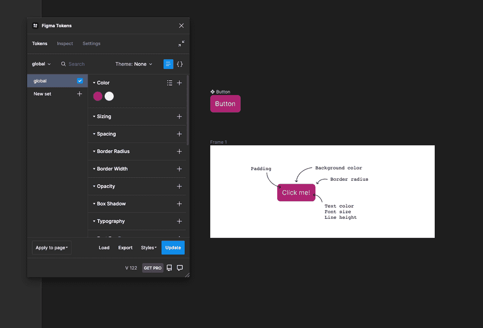
At the development level, you would have to run the tool or script that converts the tokens into CSS variables and you would be ready.
👍 I hope you liked this post.